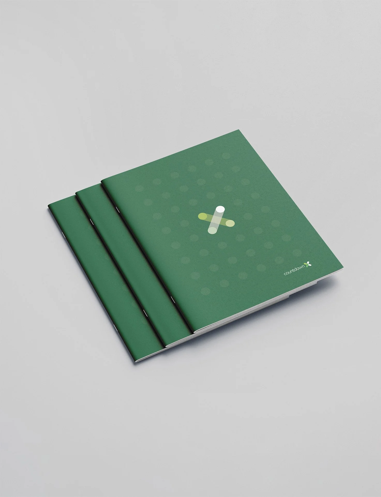
Rebranding a customer experience team.

COUNTDOWN

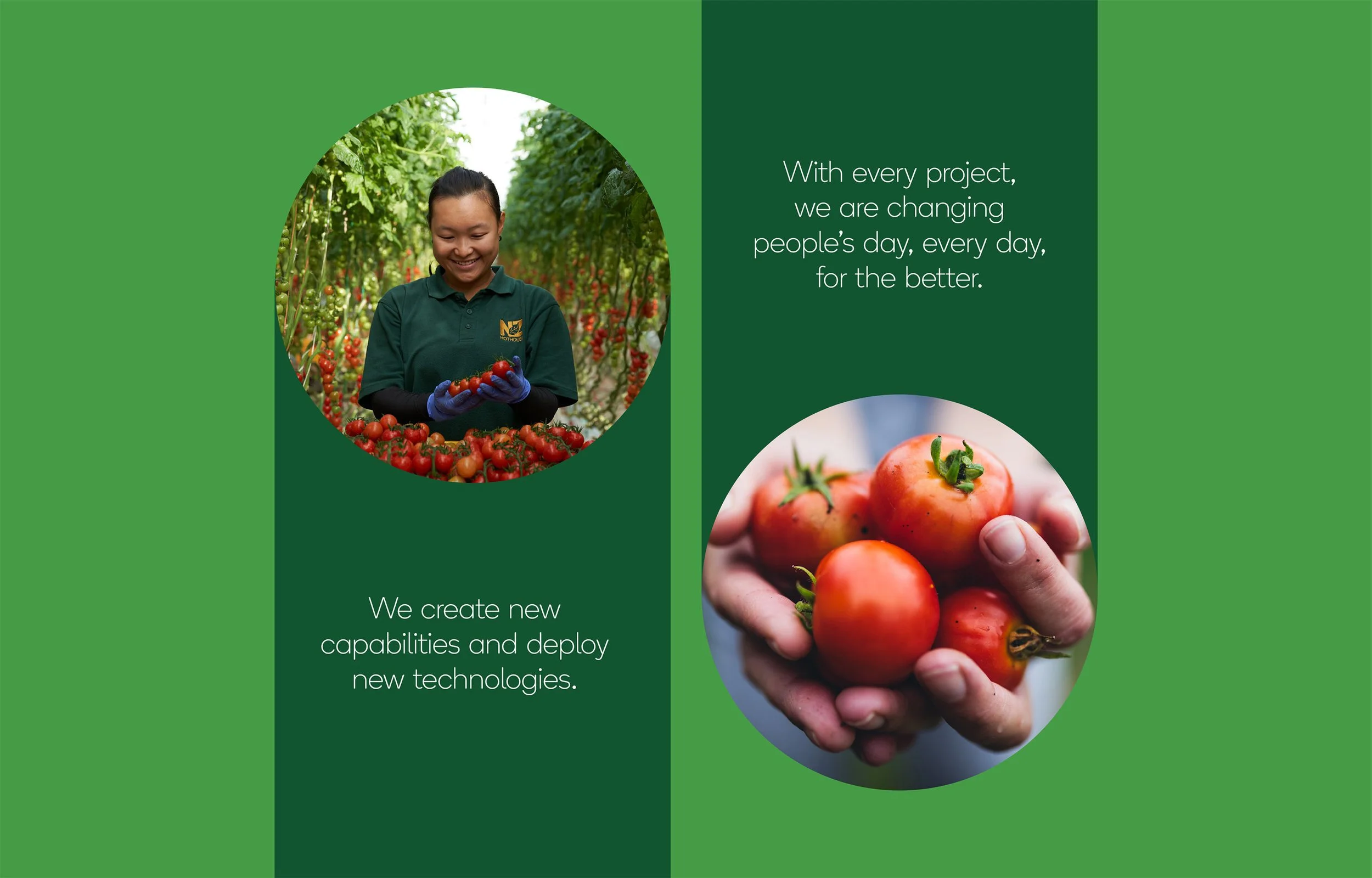
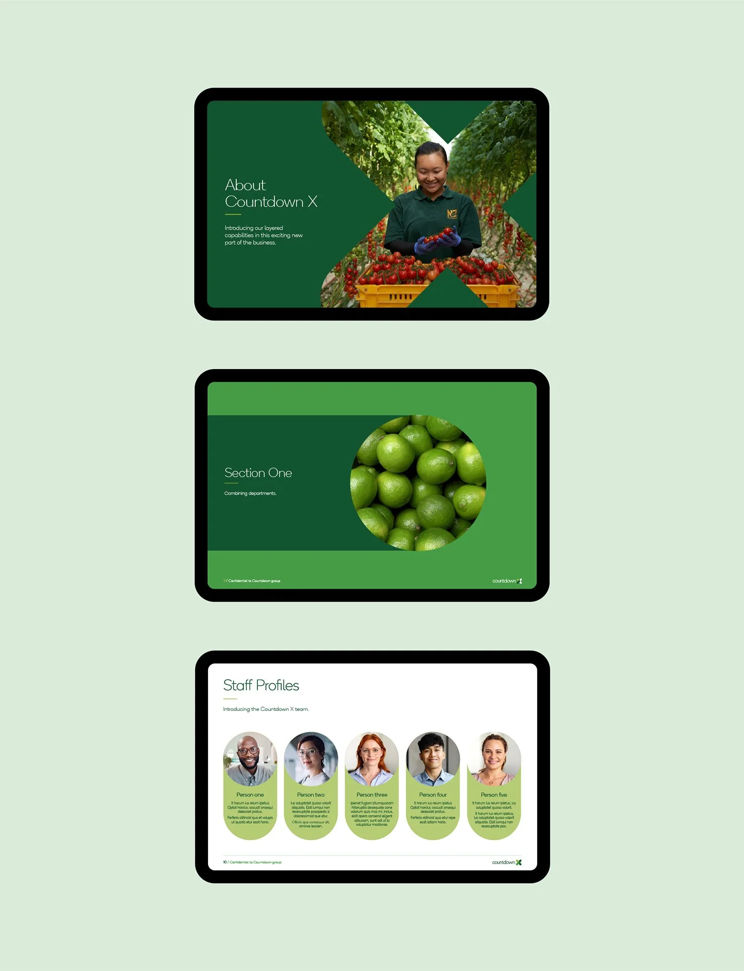
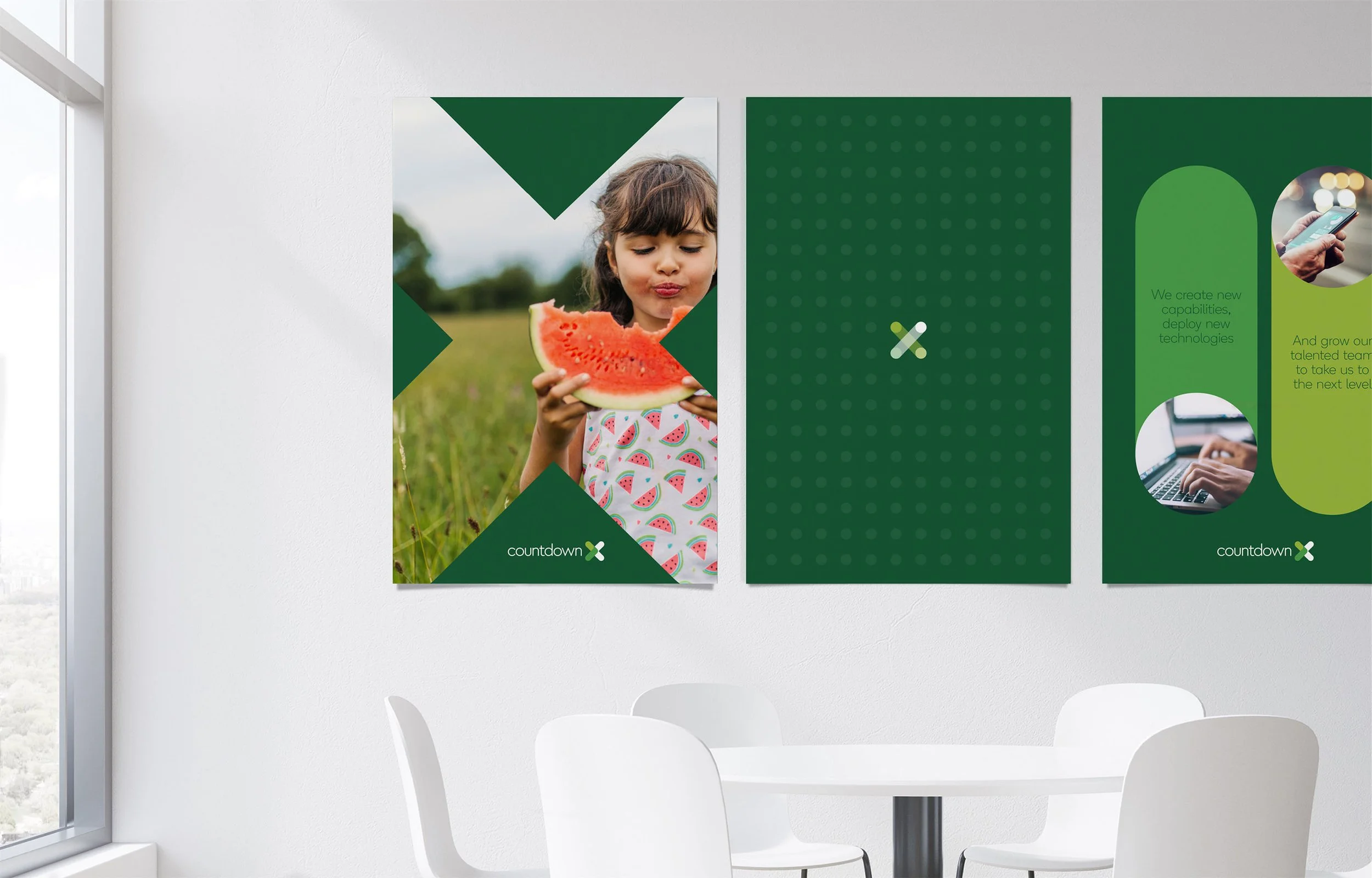
Coutndown needed a fresh and innovative identity for their newly united customer experience teams, referred to as Countdown X. Comprised of the digital, customer experience, brand, marketing and logistics departments of the business, Countdown X is rethinking the future of shopping for Kiwi’s and transforming the way we do it, fast.

The image displays a illustrative grid of the Countdown X logo pattern.
A digital illustration divided into four quadrants, each showing different arrangements of Countdown X logo that comprise of green, white, and yellow dots and lines on a dark green background.

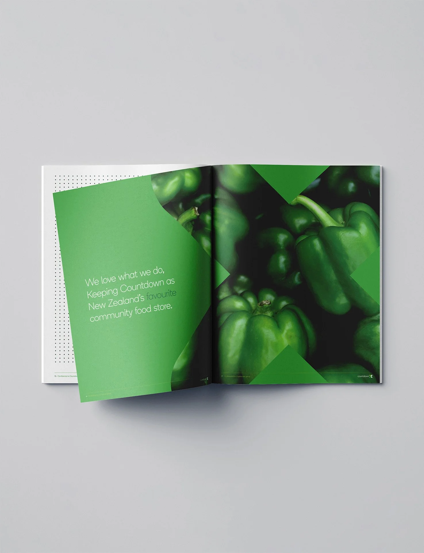
We embedded this purpose by adding meaning and energy to their brand, making the X a symbol for connection and collaboration. Reflecting the business’s agile working nature, it is a connection point for a collective of highly energised teams, moving at pace to create a better shopping experience for all New Zealanders.

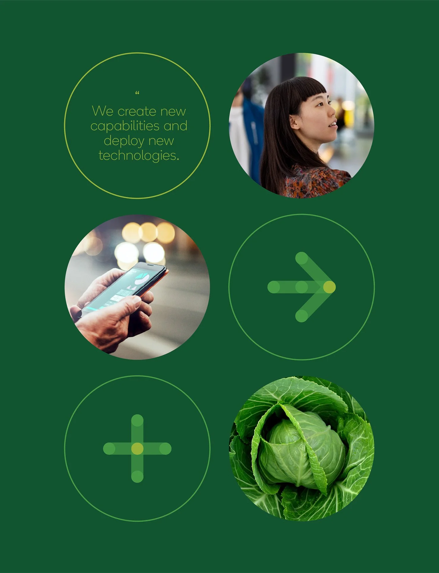
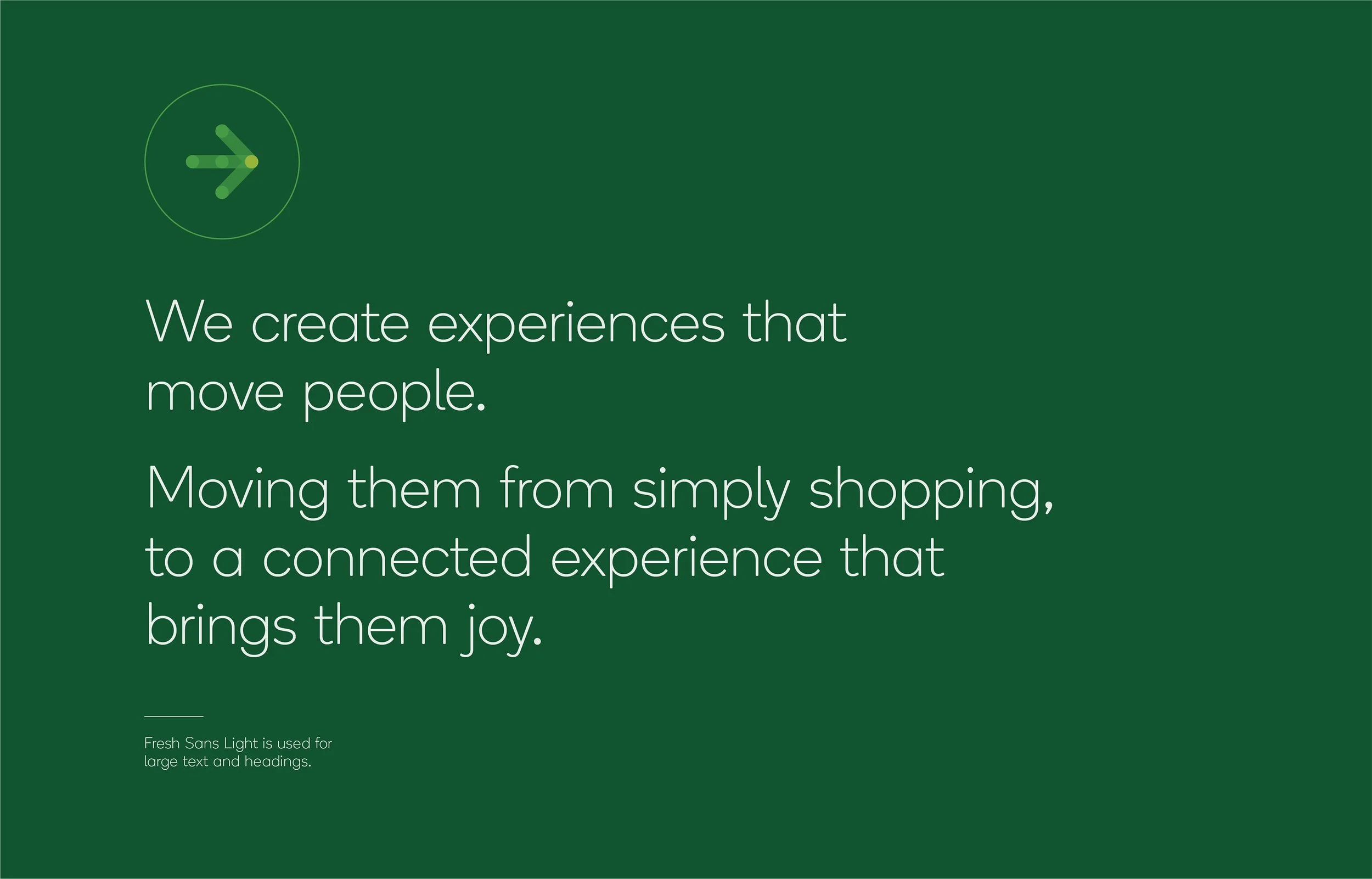
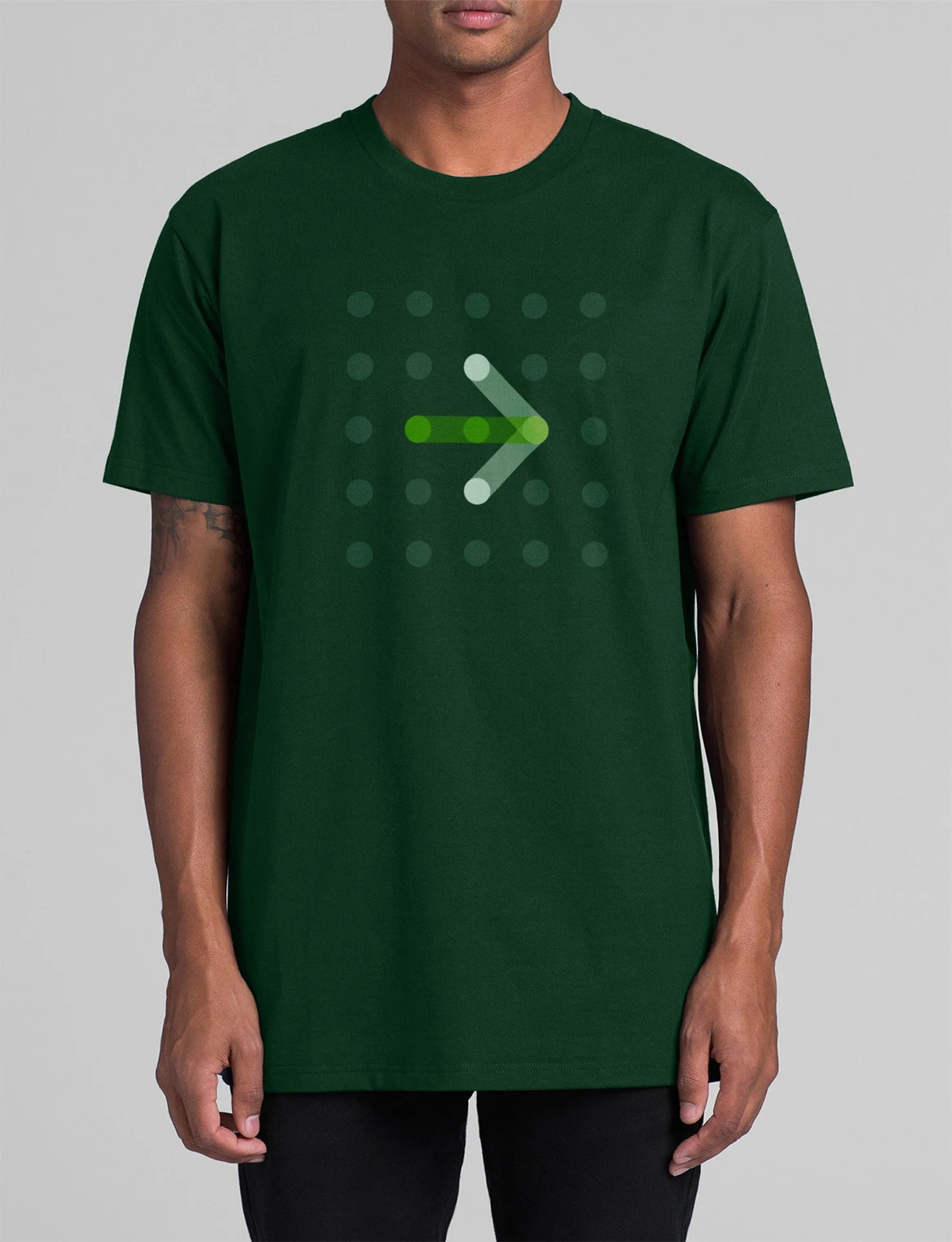
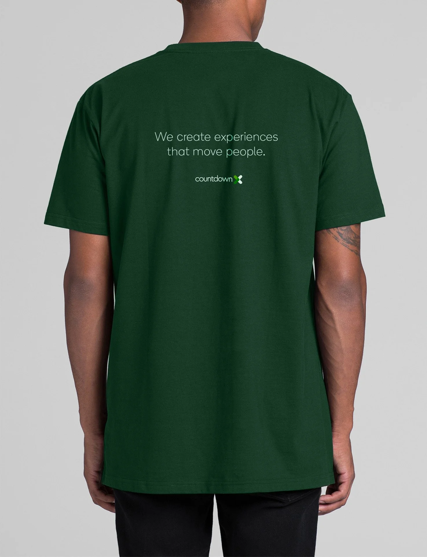
We developed on identity system built with basic shapes that are soft and fluid yet work dynamically in both static and motion formats. In motion, the identity is lively, communicating the fact that Countdown X creates experiences that move people.

A woman in a uniform with gloves is harvesting ripe tomatoes in a greenhouse. The right side shows a hand holding several fresh tomatoes, and the background contains green plant rows. Over the image, there are phrases: 'With every project, we are changing people's day, every day, for the better' and 'We create new capabilities and deploy new technologies.'
Green background with images of a woman, a smartphone, and a head of lettuce, along with arrows and a quote about creating new capabilities and deploying new technologies.
Coutndown X iconogtaphy comprising of a green chevron arrow, followed by a circle, a division symbol, and a plus sign, all made of green dots on a light green background.
A green background with a logo of a circular arrow and text that says, 'We create experiences that move people. Moving them from simply shopping, to a connected experience that brings them joy. Fresh Sans Light is used for large text and headings.'
A graphic design with a green background featuring four circular images connected by a diagonal green band. The top left circle shows hands typing on a laptop keyboard. The top right circle shows a woman in a green uniform harvesting tomatoes in a greenhouse. The bottom left circle shows a close-up of a person holding a handful of ripe tomatoes. The bottom right circle shows a person holding and looking at a smartphone.
Three green booklets with a green cover, featuring a white and yellow medical cross symbol and the 'Countdown' logo on the bottom right corner, stacked on a white surface.
Open magazine with a green-themed page on the left and a large image of green bell peppers on the right.
Green Countdown X t-shirt worn by a person.
Back of a person wearing a dark green t-shirt with the text "We create experiences that move people" and a small logo reading "Countdown" on it.
Three presentation slides on tablets with green-themed content. The first slide shows a woman inspecting tomatoes in a greenhouse, with the text 'About Countdown X.' The second slide features a close-up of green limes, titled 'Section One.' The third slide introduces staff profiles with photos and descriptions of five team members.
Poster of a young girl holding a slice of watermelon in a field with green trees in the background, with a modern green and white design and the word "countdown" at the bottom.